Wells Fargo
Design System Re-organization
Project Overview
When I joined Wells Fargo as a Visual Designer, I was tasked with re-organizing and cleaning up a design system for Wells Fargo Gateway. The project was monumental because at the time, the Customer Experience Design team was using Sketch and the design system file was often shared and passed around in the team. This resulted in the design system file being poorly maintained.
Discovery
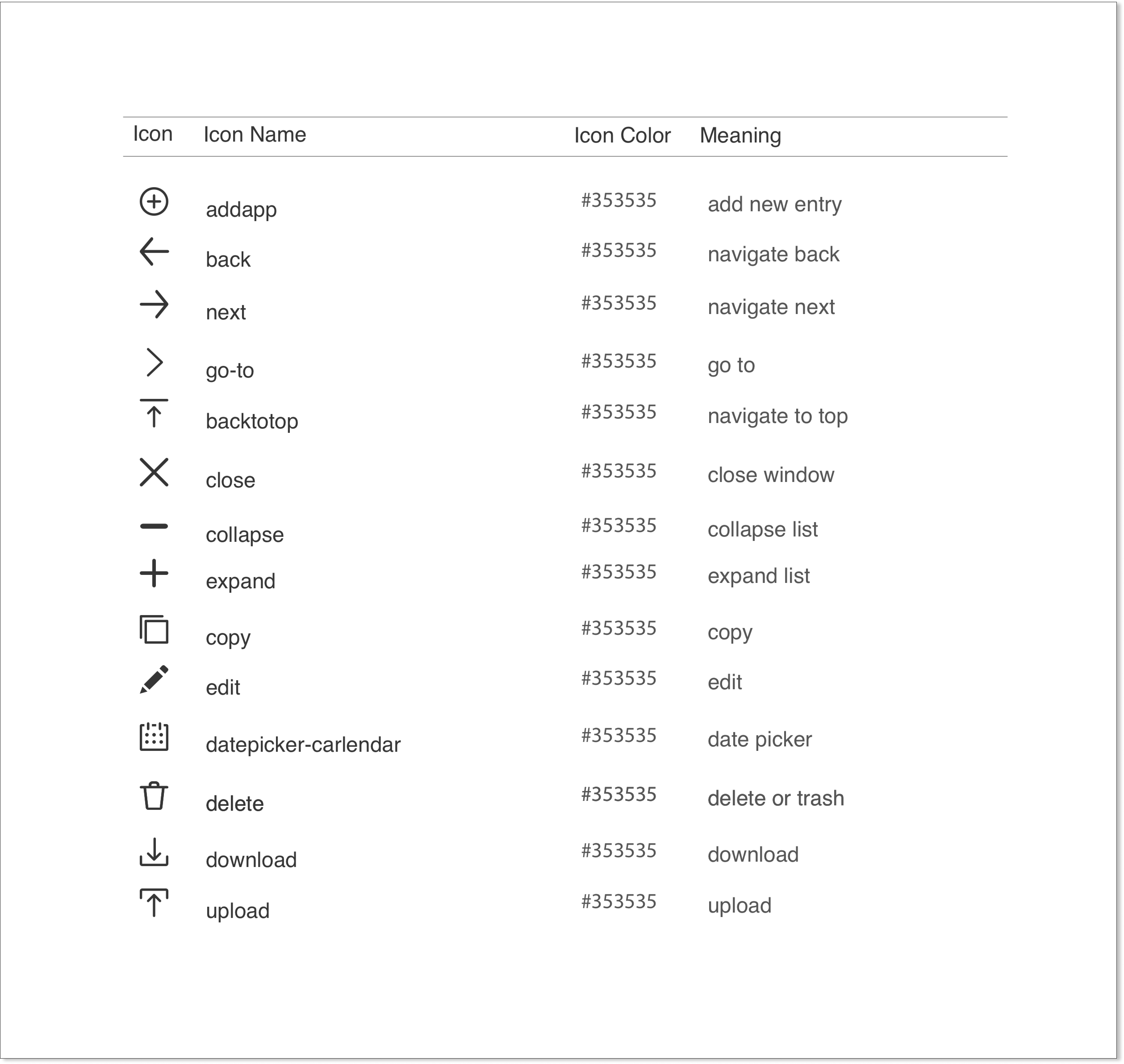
Many of the pains I encountered when re-organizing the design system file were missing UI elements that were applied in some design mockups, and even implemented on the live site. However, the UI elements never got updated. This resulted in inconsistencies in the use of UI elements, or some contractor designers using styles that are not consistent with the Wells Fargo brand. Below is an example I reorganize the icons to include documentation of its name, base color, and the meaning of each of the icons.


Adding Interactive States
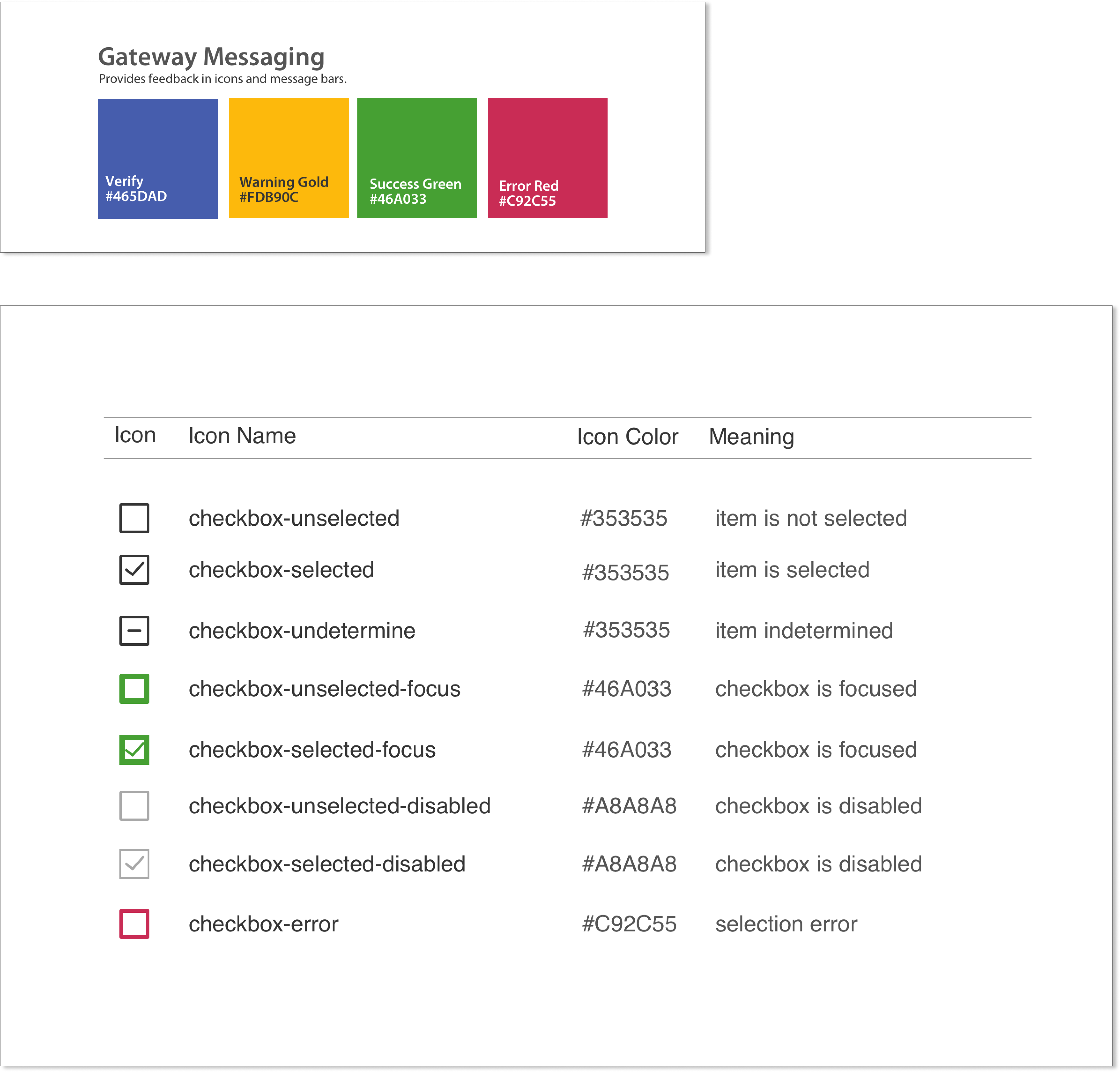
The common missing elements I discovered were icons, which I not only added, but also included different interactive states. For example, I expanded the checkbox icons to include different states, especially, active and error states. This is helpful when designing a feature with a checkbox when encountering different scenarios, such as form validation when a checkbox is required and the checkbox error state is displayed when the user failed to check on the checkbox. I also ensured the colors for active and error states are applied consistent with the Gateway product interface (UI Colors).
Adding Some Redlines
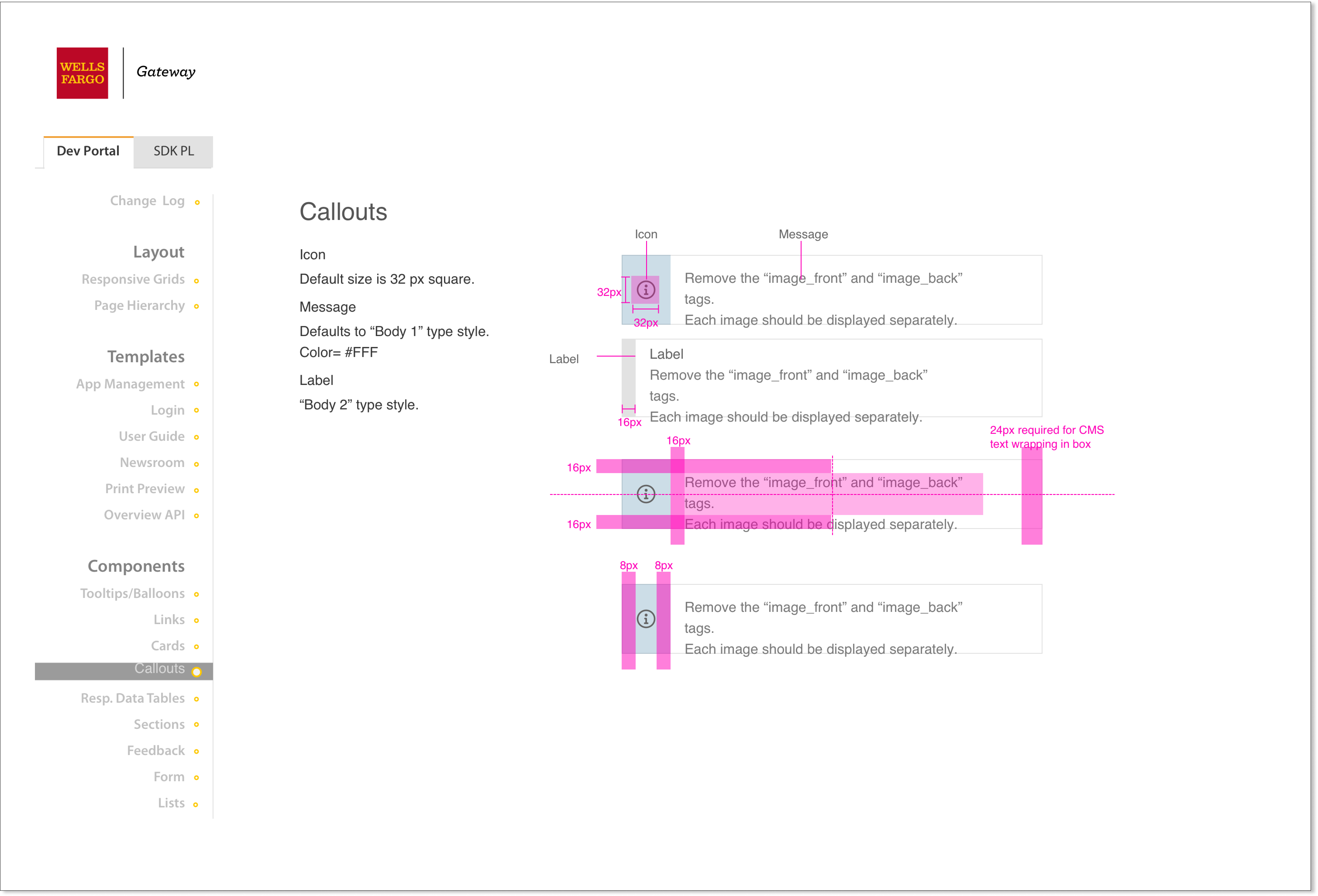
In my previous experience working with a design system, one of the most important information is the detailed redlining of a UI element or a group of components. Not all UI elements need to be redline, but some are very critical to ensure both designers and developers understand the accurate implementation in code. For example, I’ve added some detailed redlines with some annotations of Callouts where text wrapping is needed for dynamic text content.

Lessons Learned
Having a design system is very important in ensuring consistency within the design team and it is a means of communication between designers and developers to ensure common understanding of the style of UI elements. But maintaining and ensuring the design system is up-to-date is also equally important as well.