SlingStudio
Console App
Introduction
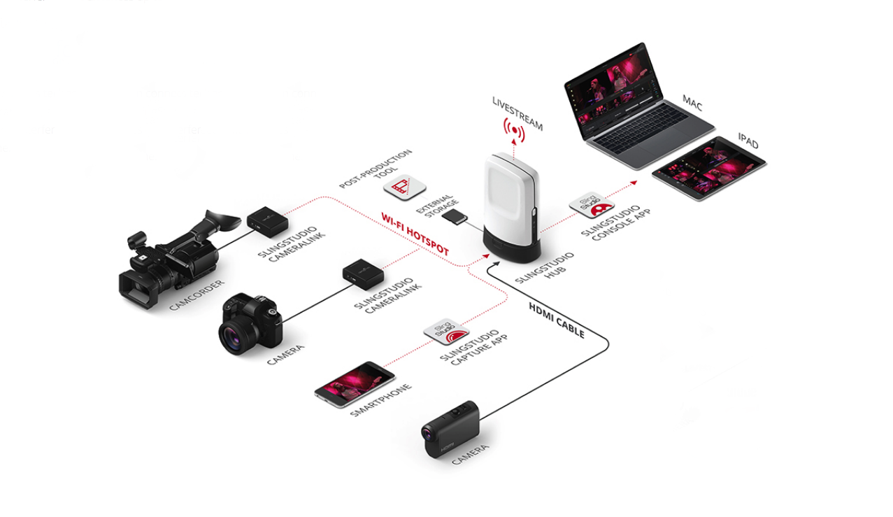
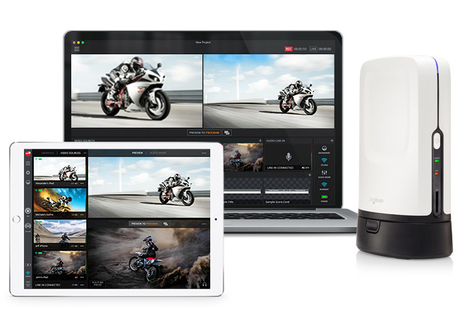
Sling Studio is a affordable live streaming multi-camera broadcasting platform and all in one wireless solution. The all-in-one wireless and portable SlingStudio Hub, connects all the cameras in the network, monitors, record and live stream HDquality video to Facebook, Youtube, Twitch, Twitter or other RTMP destinations. The Sling Studio Console App turns your iPad or Mac into your portable projection studio, allowing you to act as director and producer simultaneously. Monitor your feeds and easily switch between cameras in real time. Import your own graphics and videos, create text overlays and lower-thirds, update the scoreboard and use dynamic compositions like picture-in-picture and a quad view.
Design Process
As the Senior Visual Designer, I worked closely with both the UX team and the engineering team. The UX team will do user research, consult with the engineering and product team and work on the flow and wireframe. Then the UX team will hand off the wireframe for me to develop UI design and assets. Once the design is signed off, I deliver the specs to the engineering team for design implementation.
Sling Studio Console App: Visual / UI Design
My work with the SlingStudio Console App involved with designing for both the iPad version and the Mac version. Both of these versions have distinct differences. For example, in designing for the iPad version, the importance of “touch” interaction must be considered. Thus, certain icons need to be designed in such way so user knows that the icon can be interactive. Designing for Mac was challenging because of mobile-first approach; the Console App did not have a Mac version before.
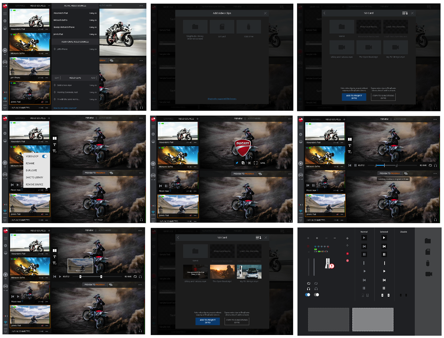
iPad Design: Import Video / Audio
Because the screen real estate of the iPad is a lot smaller than a mac, the UI relies on more compact UI elements like icons, interactive popups and switch toggles. There were more emphasis on optimizing video recording screens where users will spend the most time. For this work, I created some icons and interactive UI elements to enhance user's productivity and tasks, whether it's switching feeds, or adjusting the volumne.
MAC Design
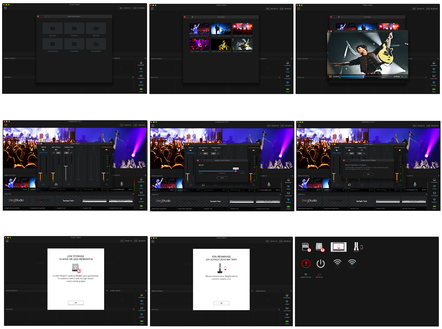
For the Mac Design, my work was primarily focused on adding enhancing visuals to the new features. For example, I've adding interactive UI to allow users to open a modal for playback recording. I've also worked on designing audio mixer feature where user can slide up and down on a sound element.
Besids the new features, I've also worked on backlogged features such as warning and error modals to inform users and develop UI elements and icons that help the users troubleshoot issues.
Delivery
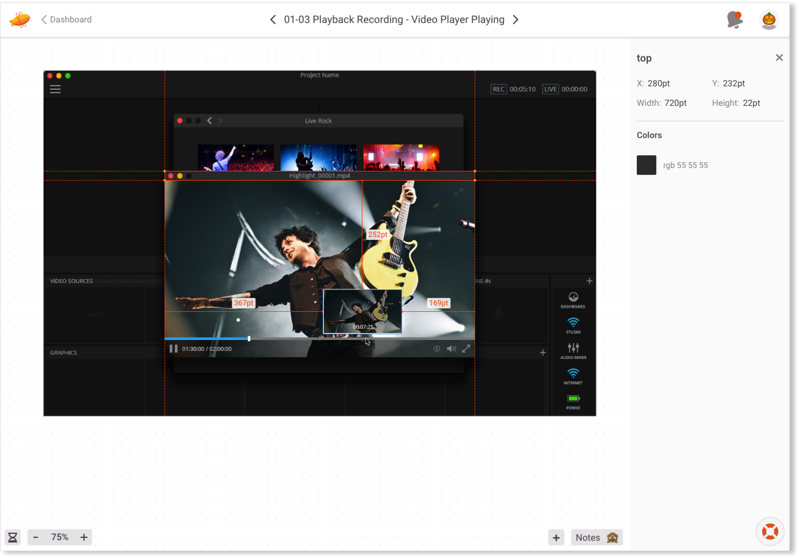
After the design was signed off by the project team, I delivered the UI spec to the front-end developers to implement the design via Zeplin. At the time, Zeplin allows developers to inspect specific elements of the design mockups like spacing and color for more accurate implementation
