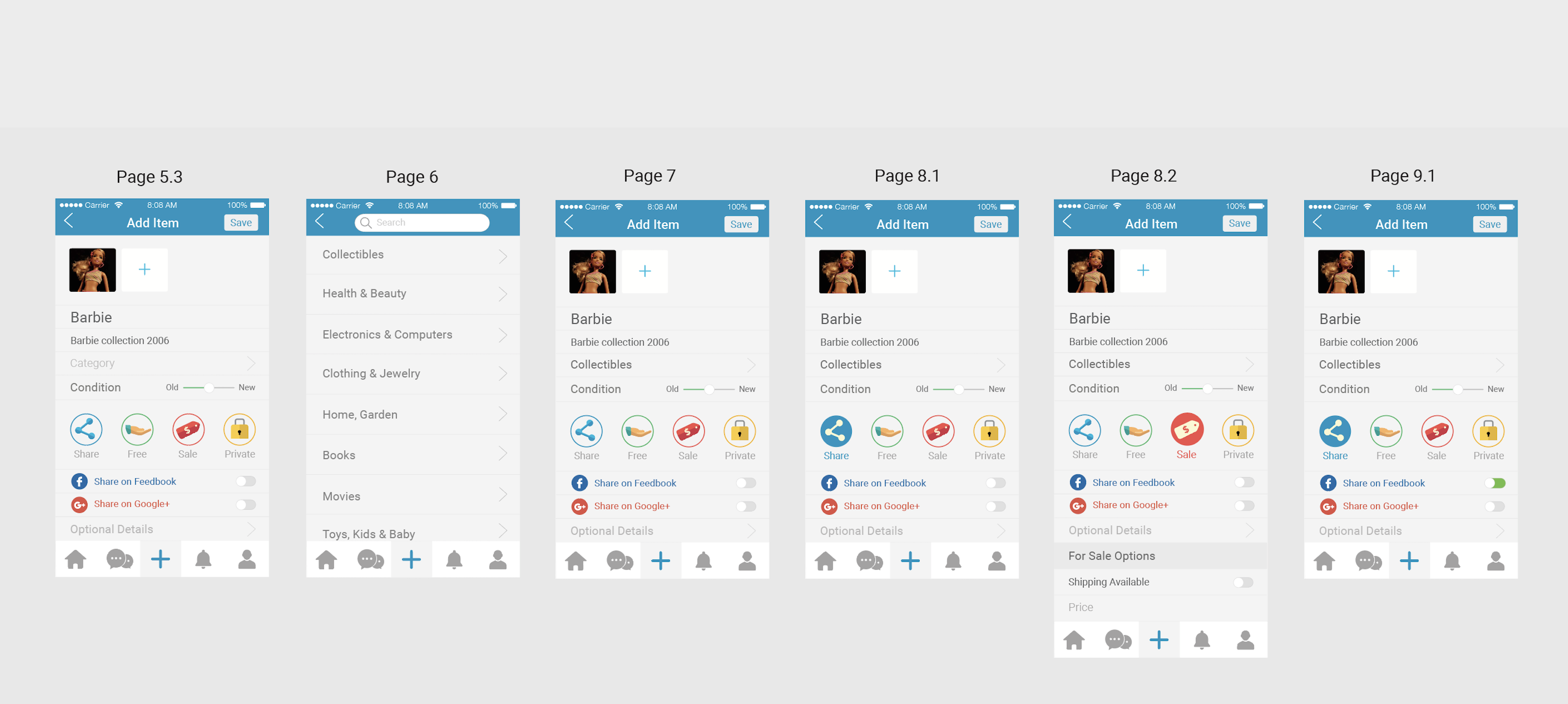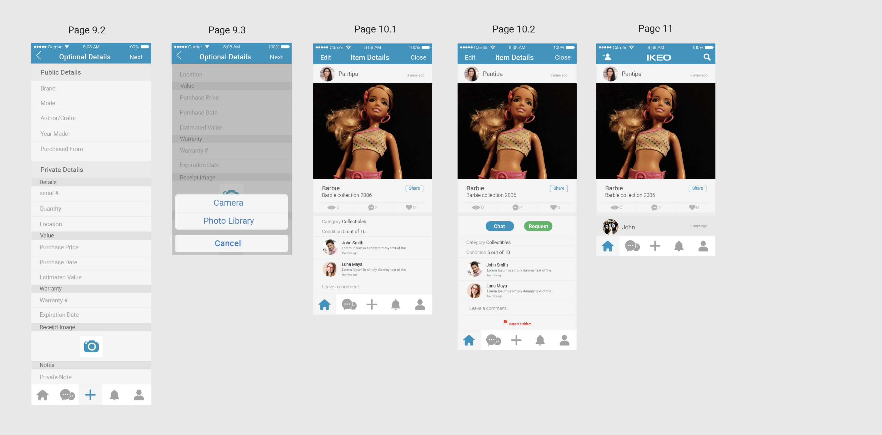
IKEO
UX/UI Design and App Development
What is Ikeo?
IKEO is a place that allows users to organize their items and share them with their close circle of friends. Users can monitor and track items that have been shared and returned. Users can also give away items or sell items to their friends. The app was launched on the App store and Google Play in July 2016.
Role
As the first and only UX/UI Designer currently working on the project, my role was to bring order to chaos by working with software engineers to develop and implement UX Design process, develop scenario and user task flows, develop Lo-Fi and Hi-Fi wireframes, develop interactive prototypes, develop and establish visual design guideline, develop concept video for UX walkthrough and marketing, and develop and design the App's website.

High Level Current UX Task Flows
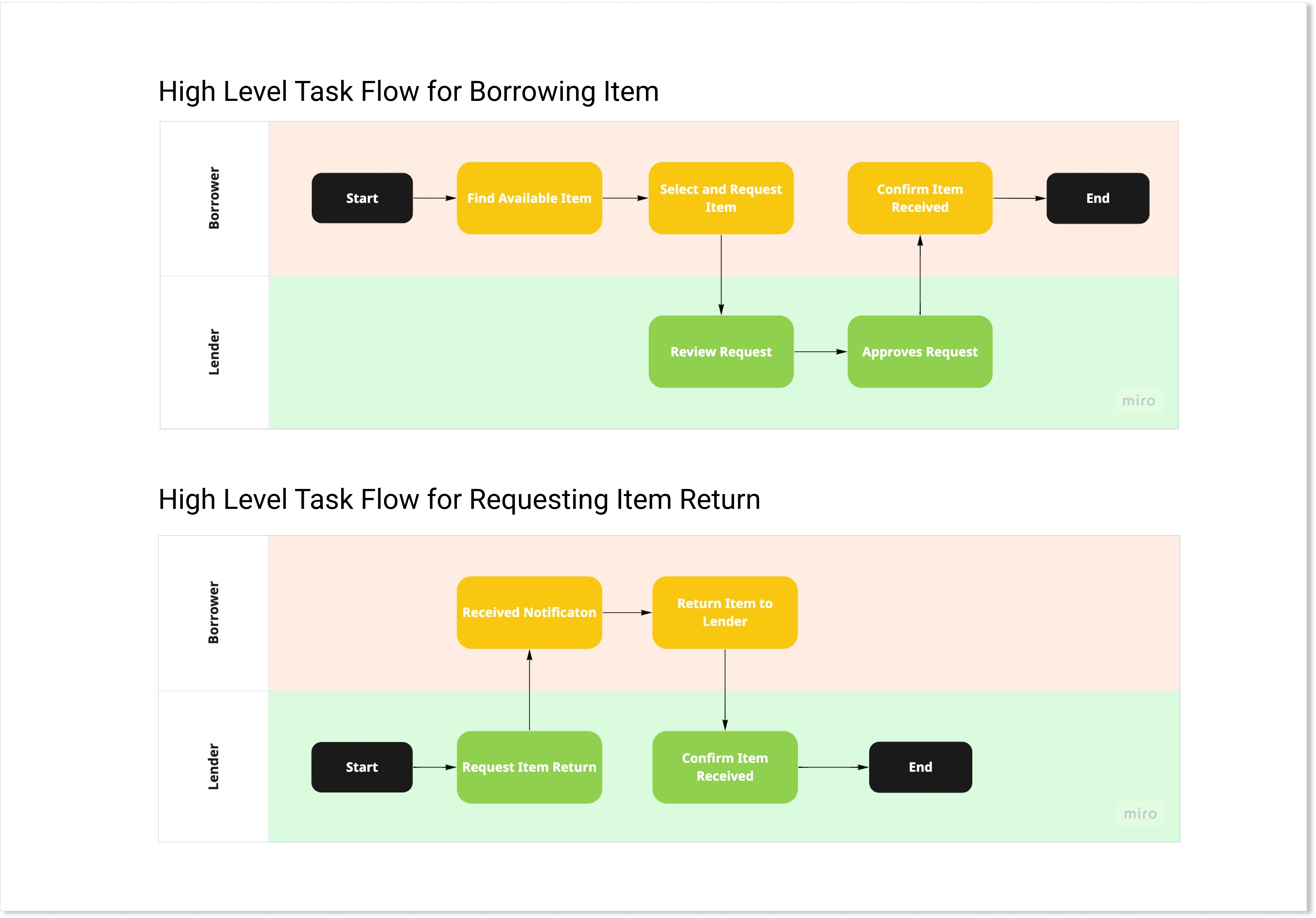
When I first joined IKEO, the developers already had a working prototype of the app. Their initial approach was to build it first then design it later. My first task was to map out the user flows of the app to get a better understanding of what users are trying to accomplish in the app, and find areas that can improve efficiency. Because the app requires interaction between two different users, I use swimlanes to map out the interaction between the Borrower and the Lender. Below is the high level flow of the interaction for users making borrowing requests and requesting a borrowed item to be returned.
Detailed Task Flows
Then I go to each instance detailing the user flow step by step. This helps the developers see the current flow as is so we can identify if there’s any step in the process that needs further exploration of how we can improve user experience. Below is one of the detailed tasks I broke down to get an idea of what the user will do in the app as a “Borrower”.

Heuristic Evaluation
After mapping out the flows, I evaluate the existing app using the heuristic evaluation method to evaluate and recommend improvements for better user experience. Screen by screen, I marked elements that either need to be added or removed. Below is an example of one of the task flows.

Wireframe Sketches
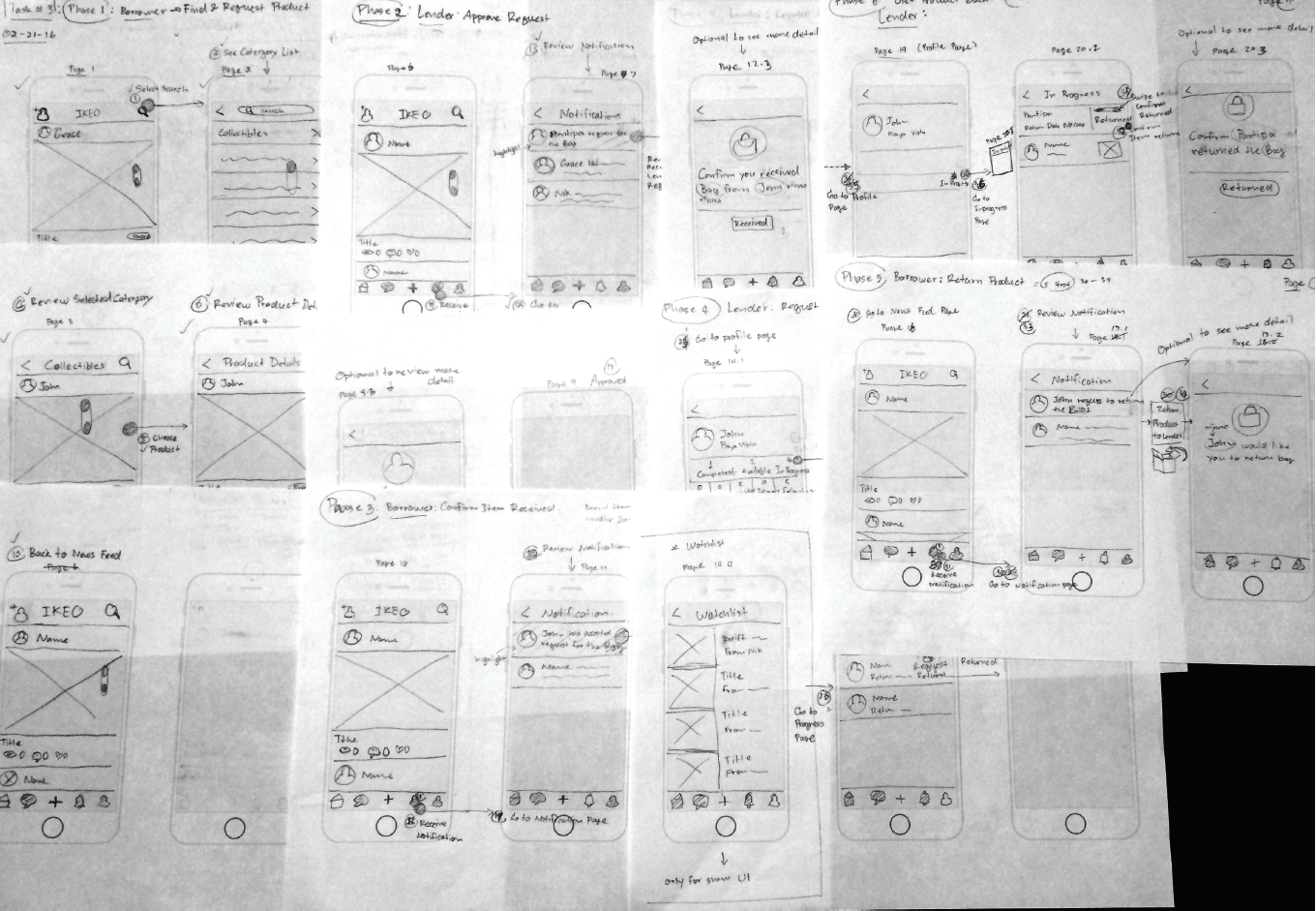
Because the app needed a lot of redesign work, I pursued further to sketch out the app in wireframes so I have a visual idea of the flow and how different users will interact with the app.
Med-Fi Wireframe
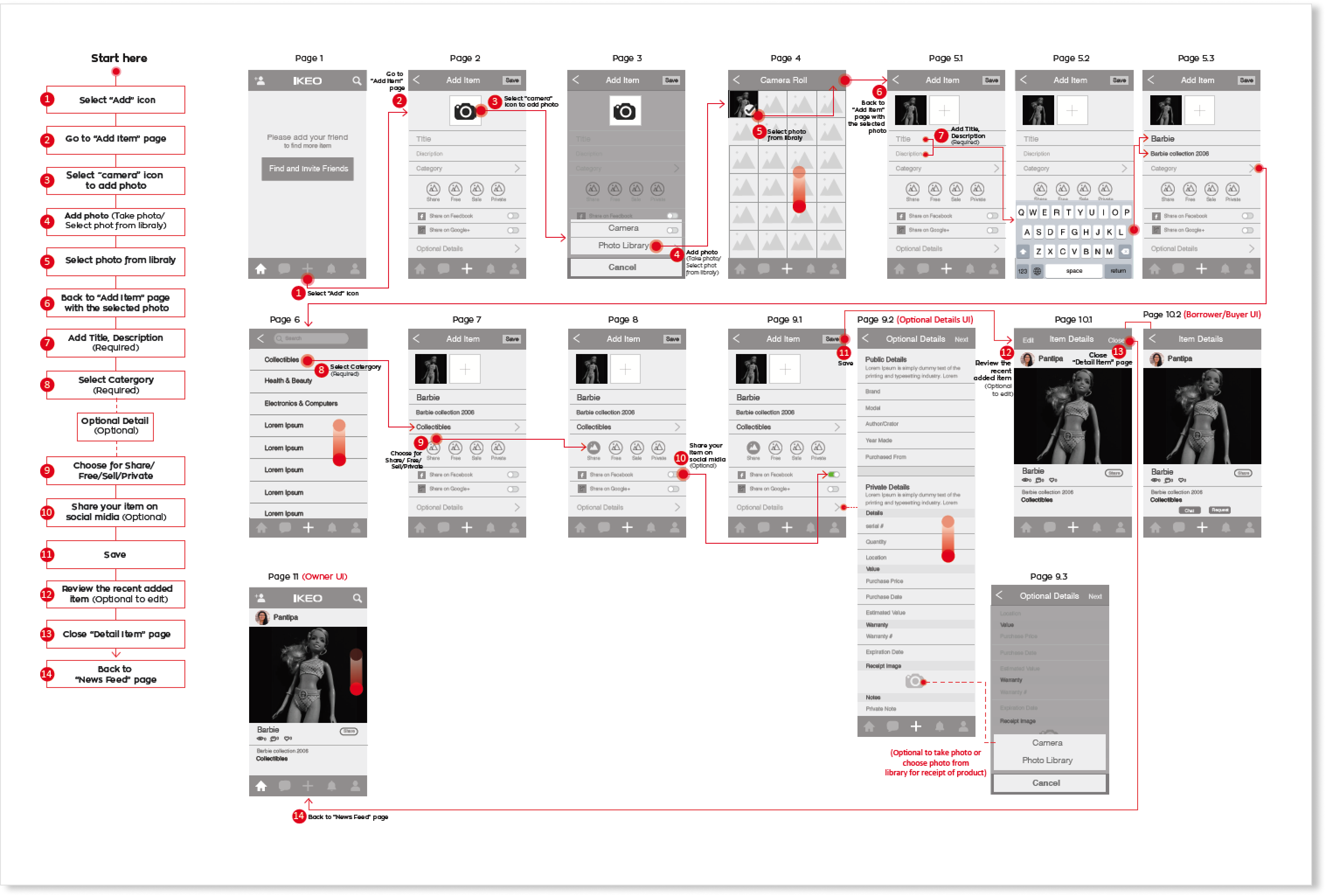
After sketching out the wireframe, I moved on to draft the wireframe in medium fidelity. This part of the process was very crucial for me because it helped the developers focus more on how we can improve usability, which was lacking from the very beginning. I put the user task flows side-by-side with the wireframes so the developers can understand the new user flow when going through them.
Iconography
Before moving on to the high fidelity mockup, I spent some time focusing on creating icons that were meaningful and easy for users to understand. I noticed early on, the app was very text heavy and it was generally overwhelming for users. Icons can easily help give users quick visual cues and lessen the distraction on the user interfaces. I developed icons for different states (i.e. active, disabled, normal, etc) to make the app more interactive for the app users.
Optional Style
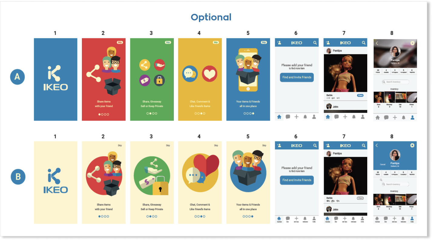
For the High fidelity mockup, I developed different designs to give the app developers choices of different look and feel for the app. The choices were not limited to one design, and I allowed developers to select difference elements in the design, and incorporate their feedback into the final design.
Final Design
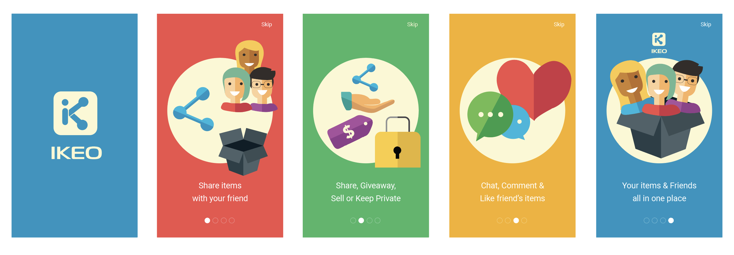
Introduction Walkthrough
Task Flow: Add Item

