Common Sense
Atomic Design System
Introduction
Common Sense Media is the leading independent nonprofit organization dedicated to helping kids thrive in a world of media and technology. Common Sense empower parents, teachers, and policymakers by providing unbiased information, trusted advice, and innovative tools to help them harness the power of media and technology as a positive force in all kids’ lives.
I was hired as a contractor to work on developing visual design system for Common Sense. Their current style guide was outdated and needed to be improved with better documentation and organized into a Atomic Design System. In addition, Common Sense has three different sites serving different audiences, and each sites lacks design consistency. This project was a large undertaking as the tasks were split between two designers, and it requireed collaborating with many stakeholders including the Engineering Team, Social Media Team, Marketing Team, and Creative Team.
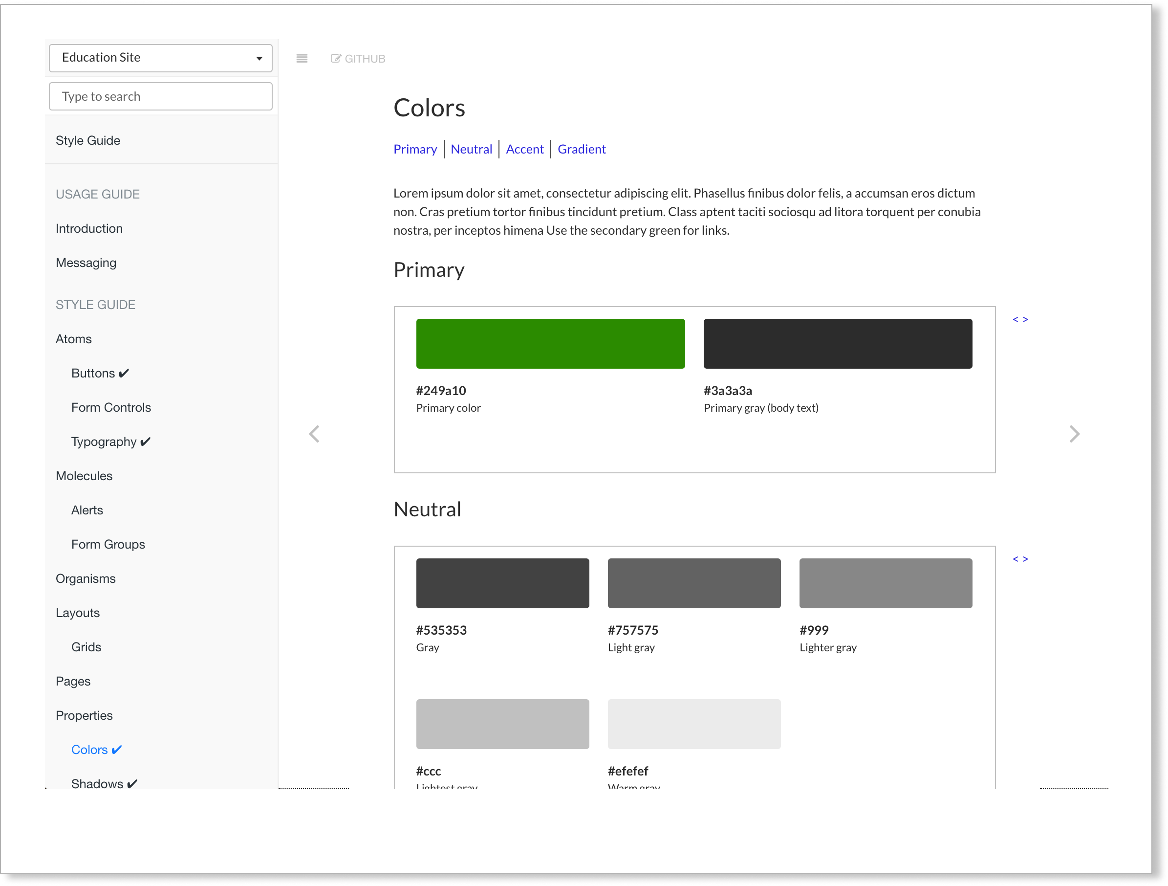
System Structure
Originally, Common Sense just had Style Guide that consisted of design guidelines for elements such as color, typography, layouts, etc. The Art director requires the guideline to be organized into a design system that included groups of components. Hence, the design system was organized based on the Atomic Design System. The system is organized into Atoms, Molecules, Organisms, Layouts, Pages, and Properties. For the purpose of this portfolio, I will show a subset of my work on the design system.
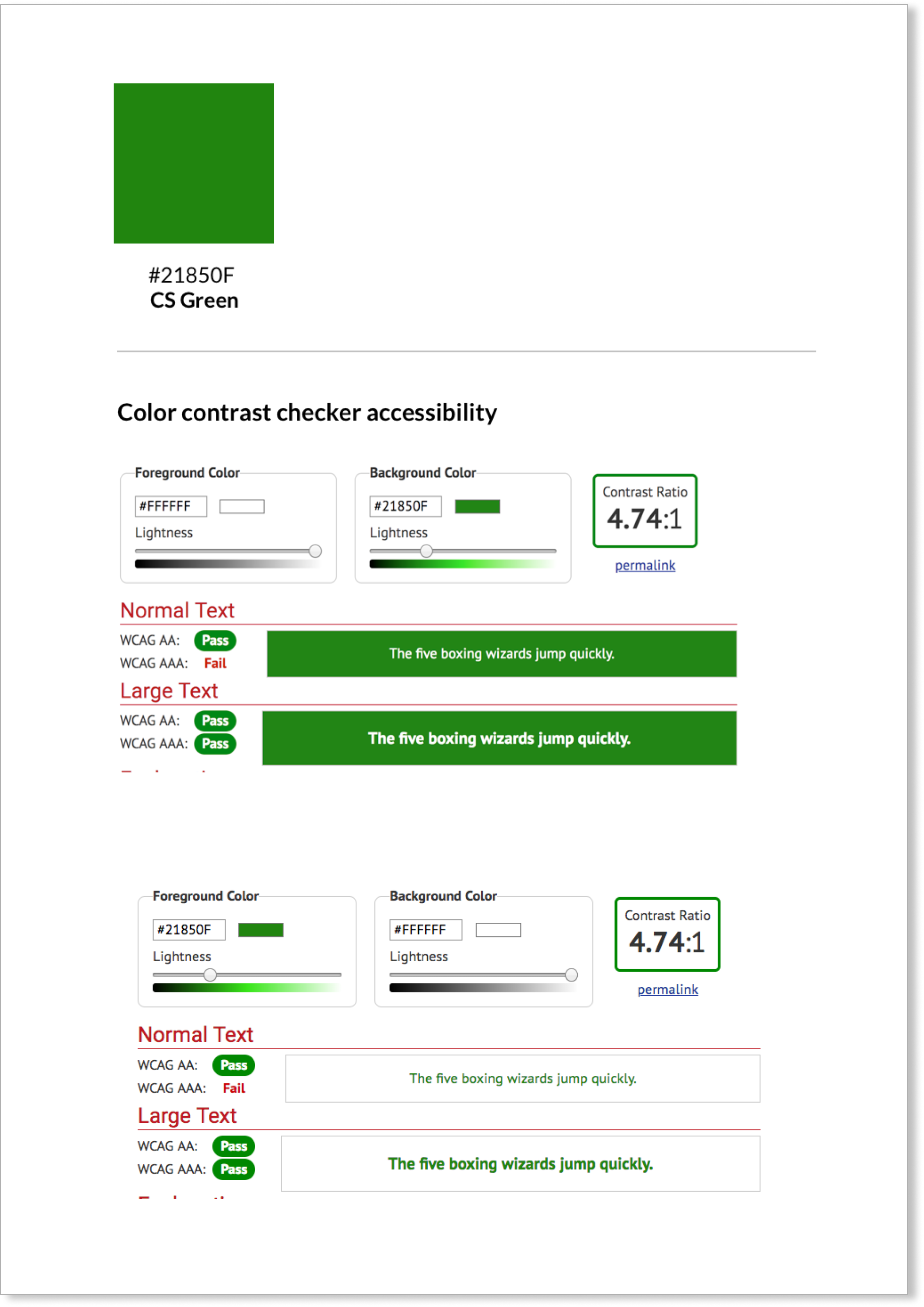
Color and Web Accessibility
At the time, web accessibility was relatively new in the technology industry. I was first tasked with re-examining the brand color for accessibility since it hasn’t been done before at Common Sense Media. I used the color contrast checker to ensure text and the background color have enough contrast for a user with color vision disability.
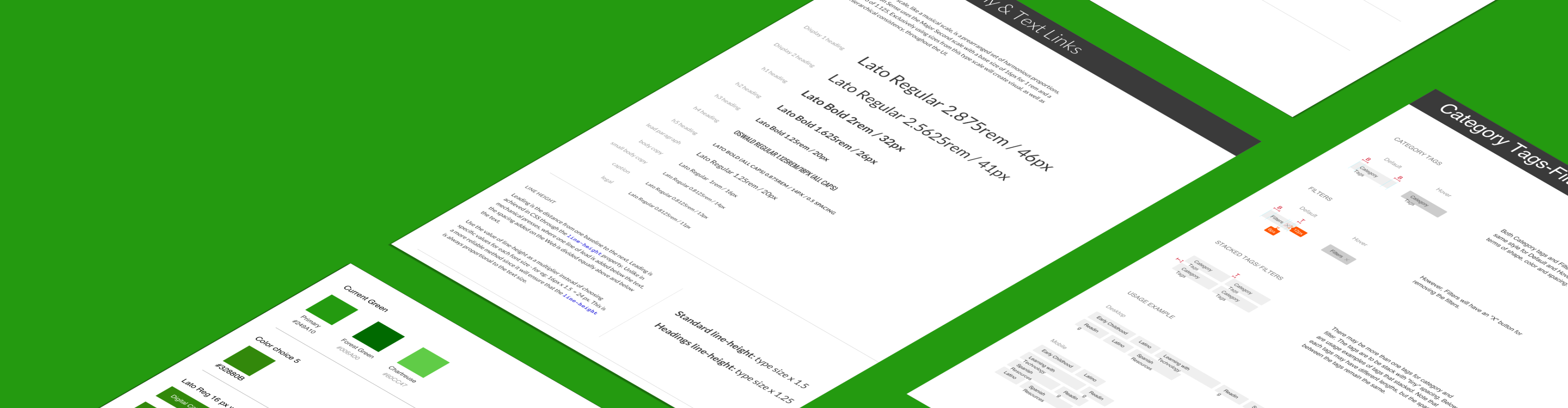
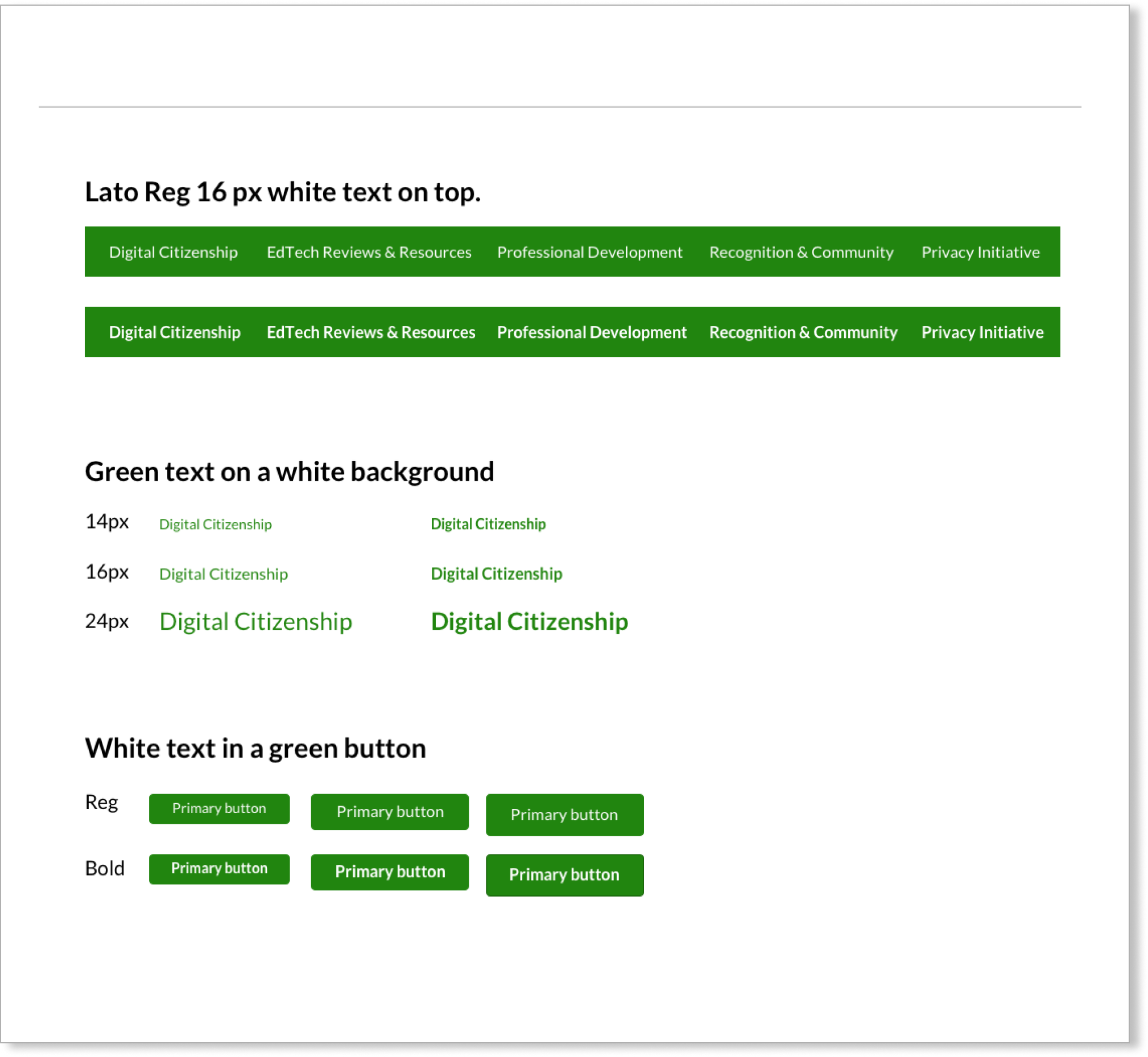
Applying Accessibility with Typography
Once I validated the WCAG testing, I proceeded further with applying our primary font Lato to see how it will look in different font sizes and on different UI elements. The purpose of this test is to confirm if the typography works as well because the font type may not be compatible due to low visibilty or too much details on the font type. For example, some font type that has a small tail at it's end may be harder to see if there's low contrast between the background and foreground text.
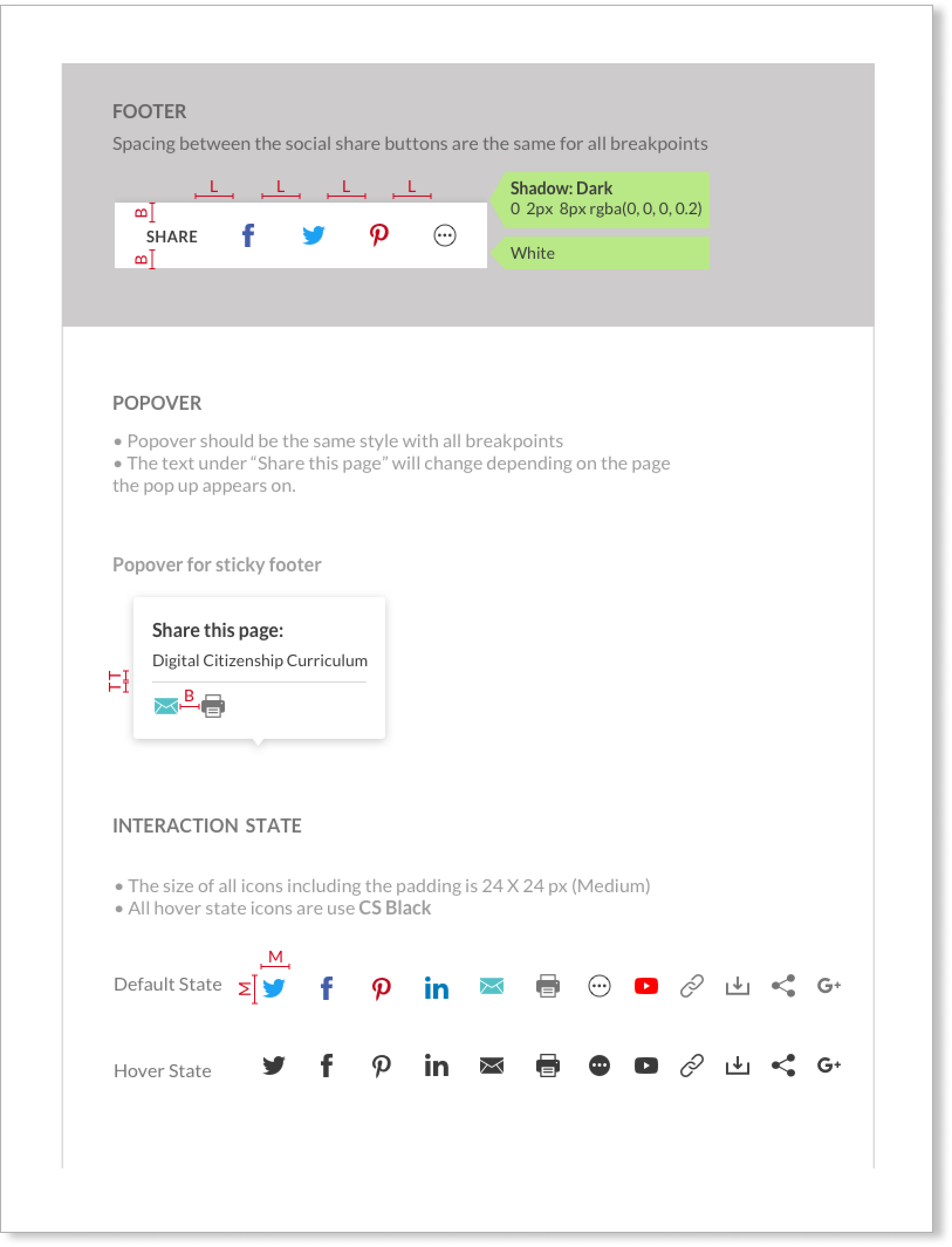
Social Share Icon
CommonSense Media relies heavily on sharing their reviews via social media. Hence the visual design of Social Share icons and interactive elements were extremely vital. However the style of the Social Share elements were different across three sites that Common Sense had. So I was tasked with designing social share icons that can be used for all sites. I start at the atomic level, refining social media icons, then at the molecular level, put these icons together to create UI elements. Finally, I put the molecules into organisms to see how the layout would look like on a page.
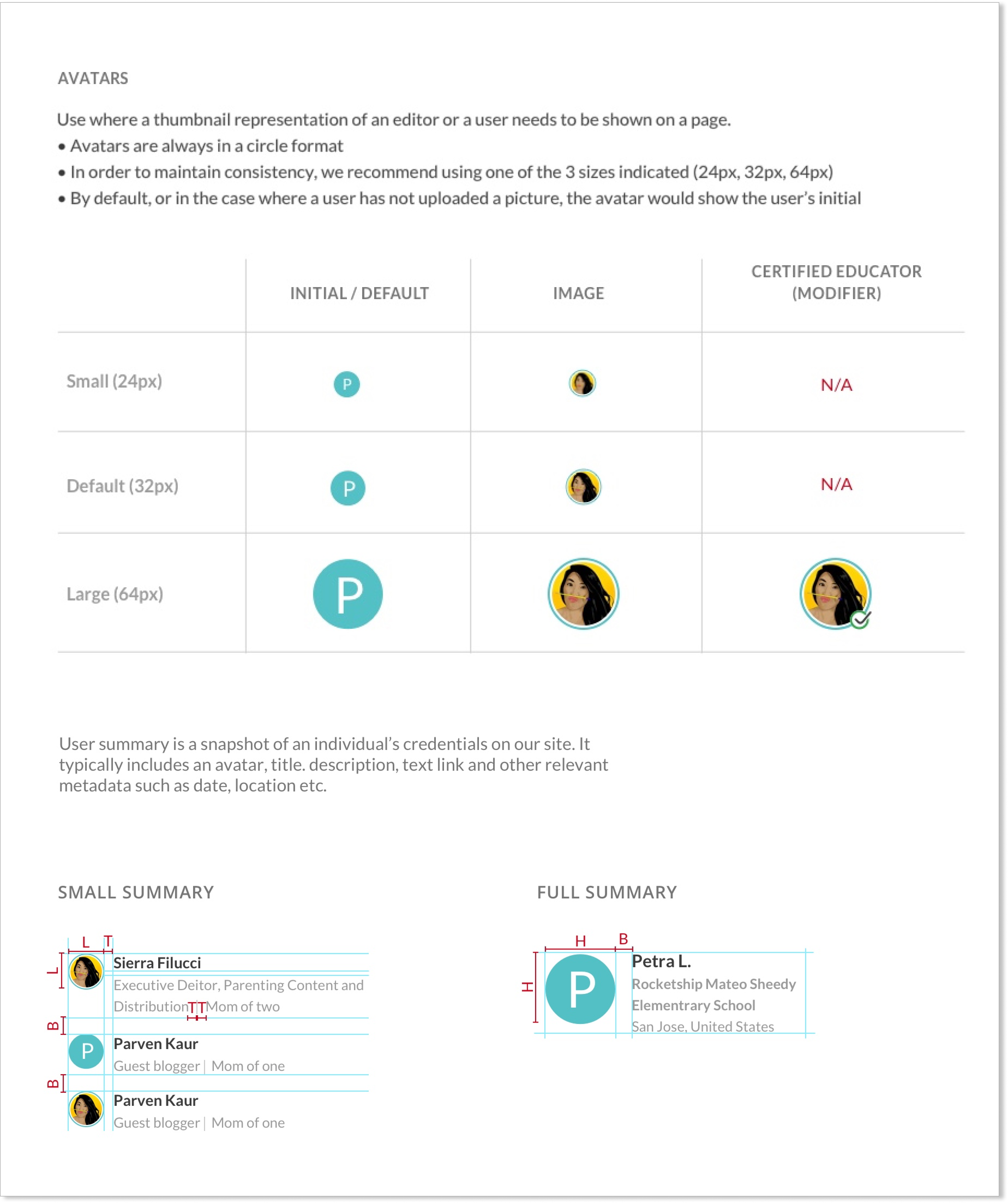
Avatars
Avatars were also another element that were inconsistence across threesites. Using Atomic Design methodolgy, I start with refining the avator icons and other smaller elements such as typefont for name, title, etc at the atomic level. Then I put these elements together as molecules to see how it will look as an Avatar with text summary of user info.
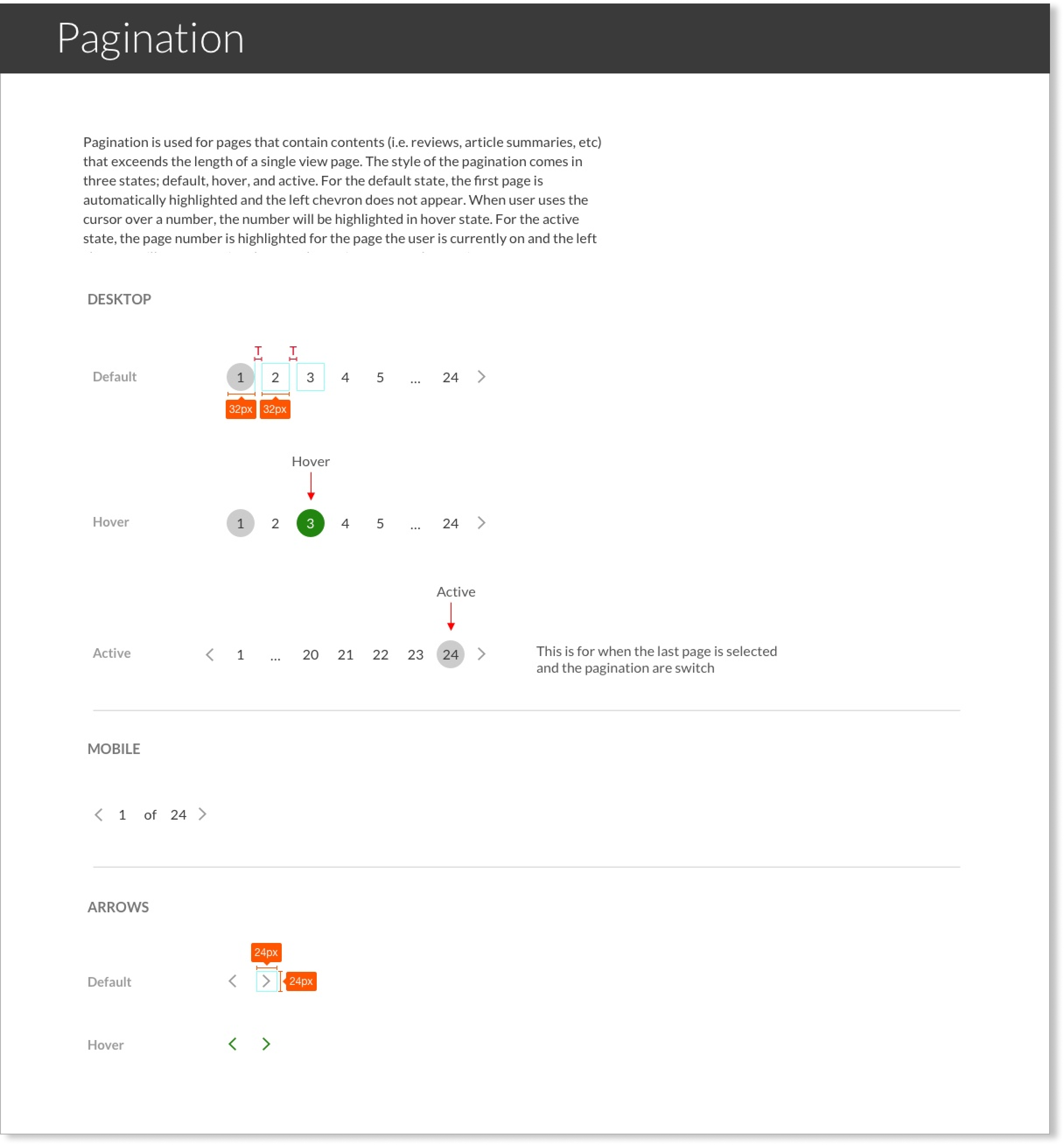
Pagination
The design for pagination was not only inconsistent across three sites, but also inconsistent at different breakpoints (desktop, tablet, and mobile) for each of the sites. I was task with finding a universal design for pagination. Starting at the atomic level, I focused on refining smaller elements, such as page numbers, active and hover states, and chevron arraws. Then put them together into different molecules based on different breakpoints.
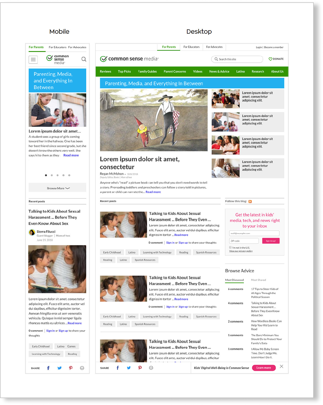
Putting Them Altogether
Based on the Atomic Design System principle, I put all the elements I have designed into a layout for both mobile and desktop mockup to see how it looks. This example below became the based template and guideline for all the UI elements in the Common Sense Media design system.